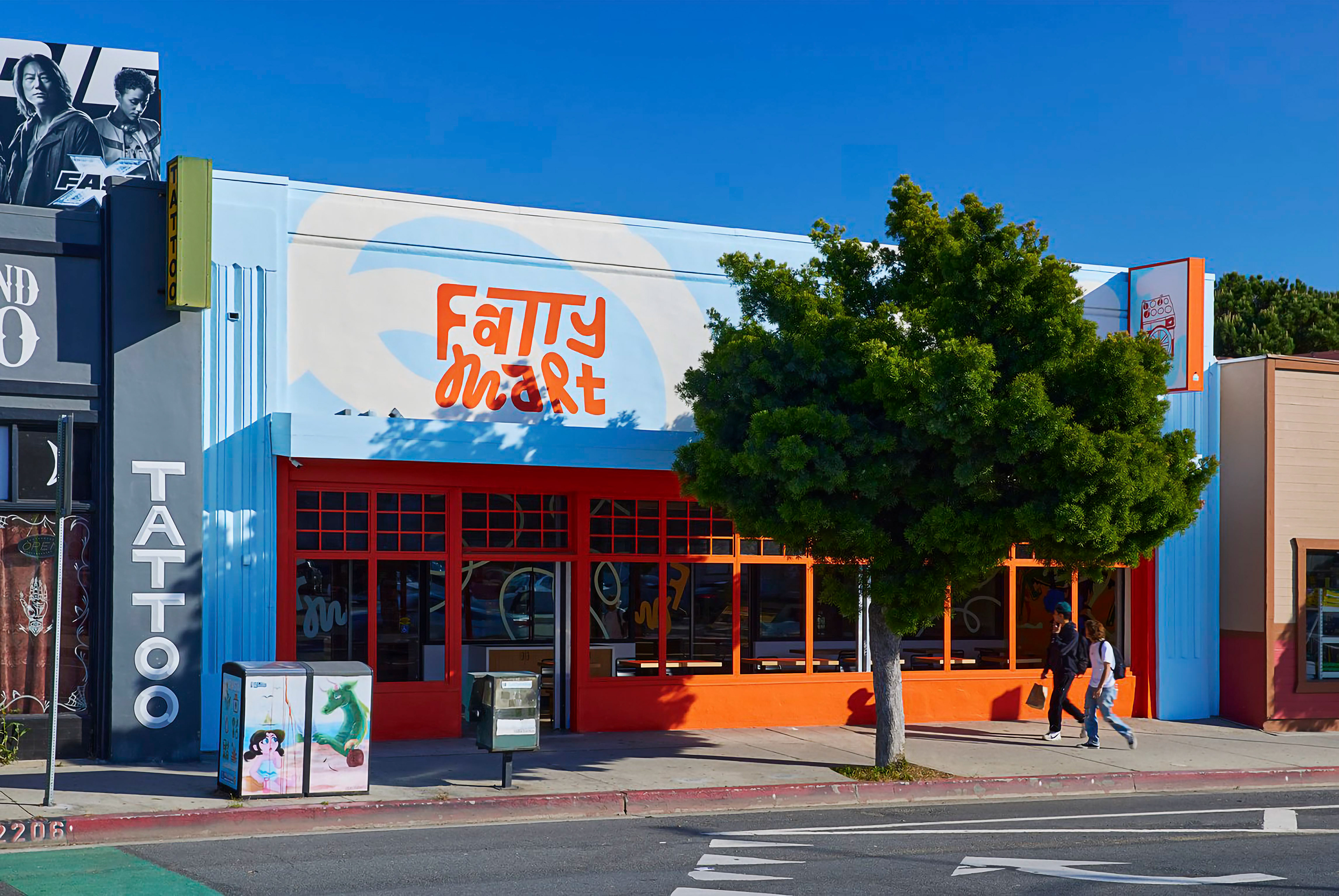
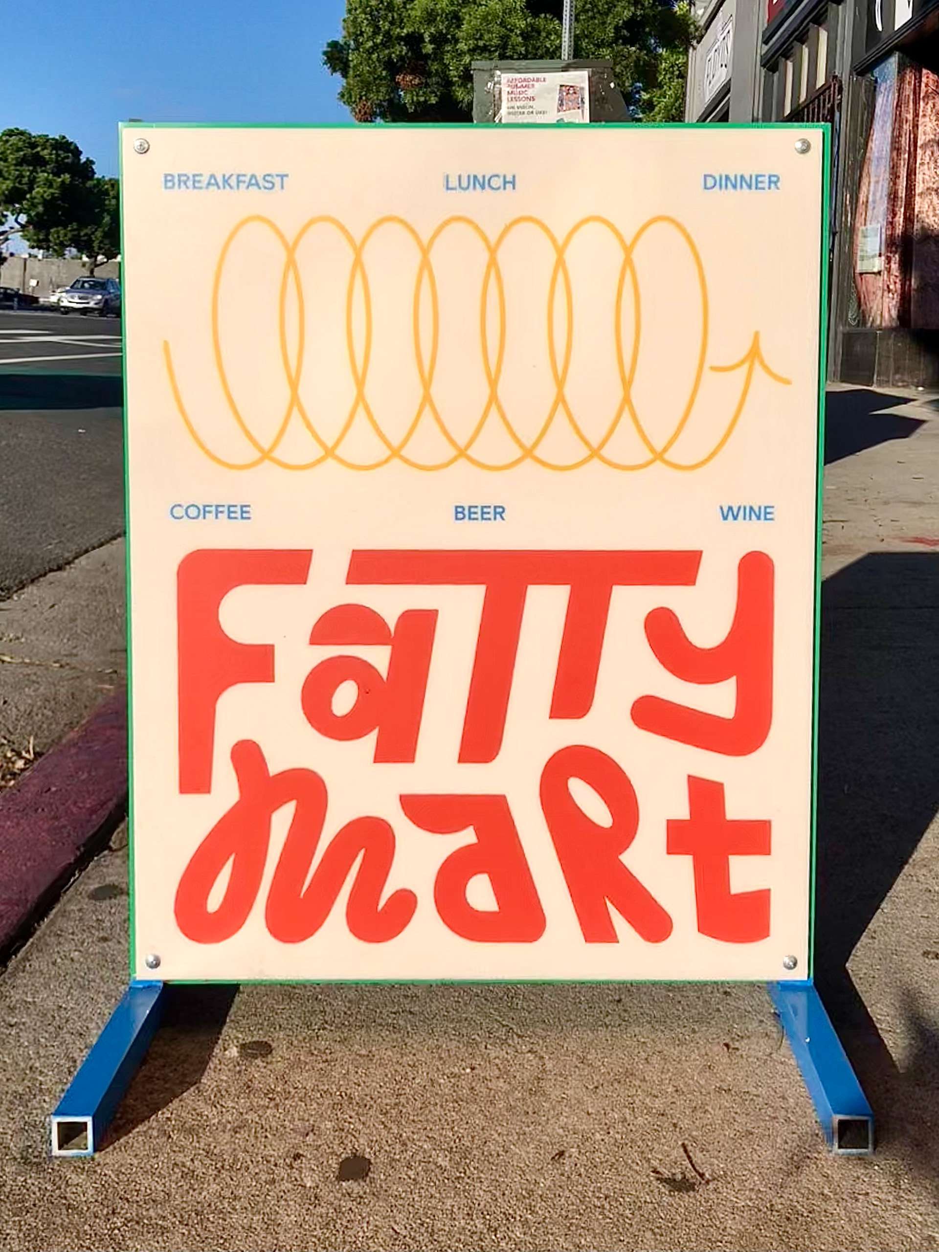
The loop serve as a main brand element, as it signifies a path to the future and a road to adventure. It is found within the M of the logo and throughout the store as a part of the window graphics and signage icons. It can also be stretched out, relooped, or coiled up to create more possibilities for graphic treatment.
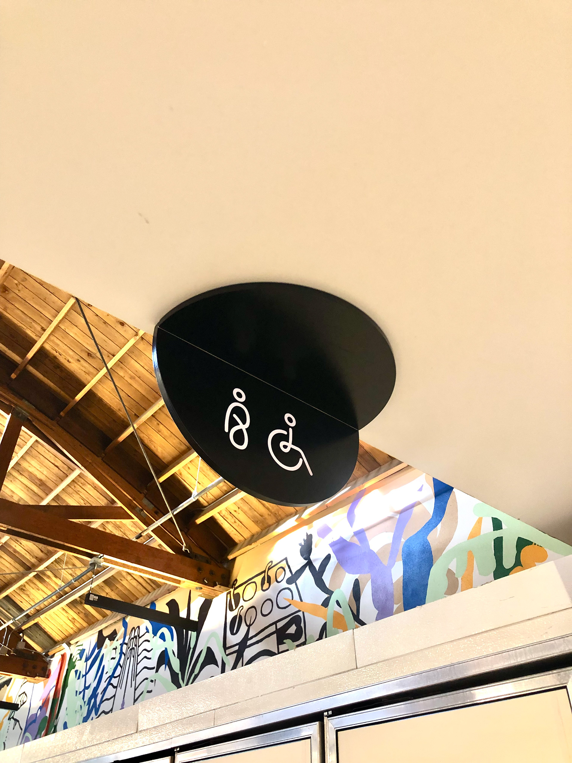
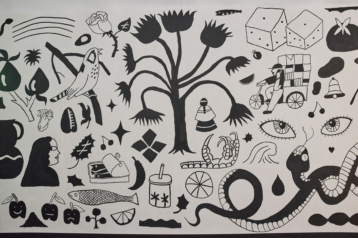
A system of iconography was developed in collaboration with illustrator Josh Cochran and were integrated into the brand, signage, and murals.
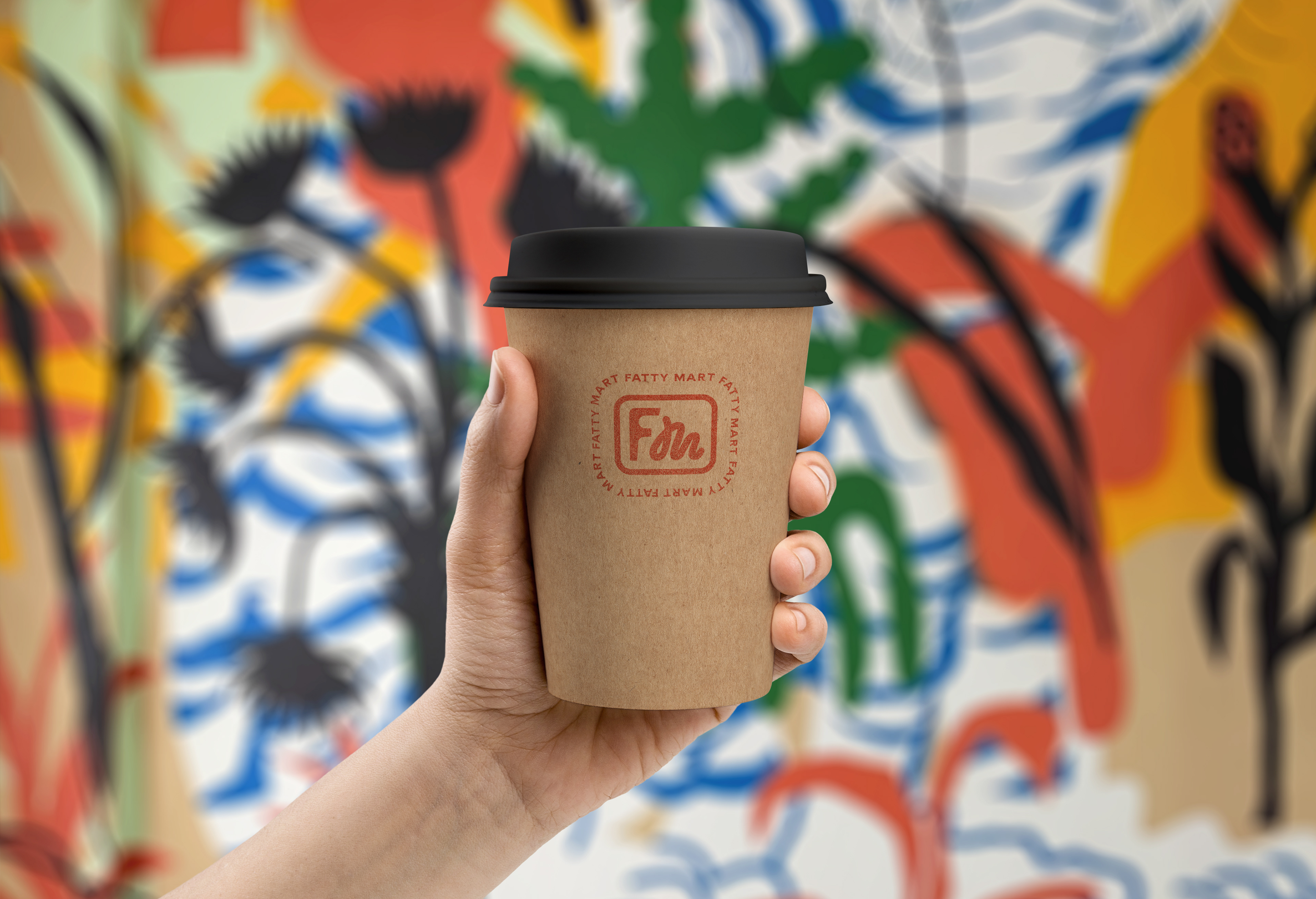
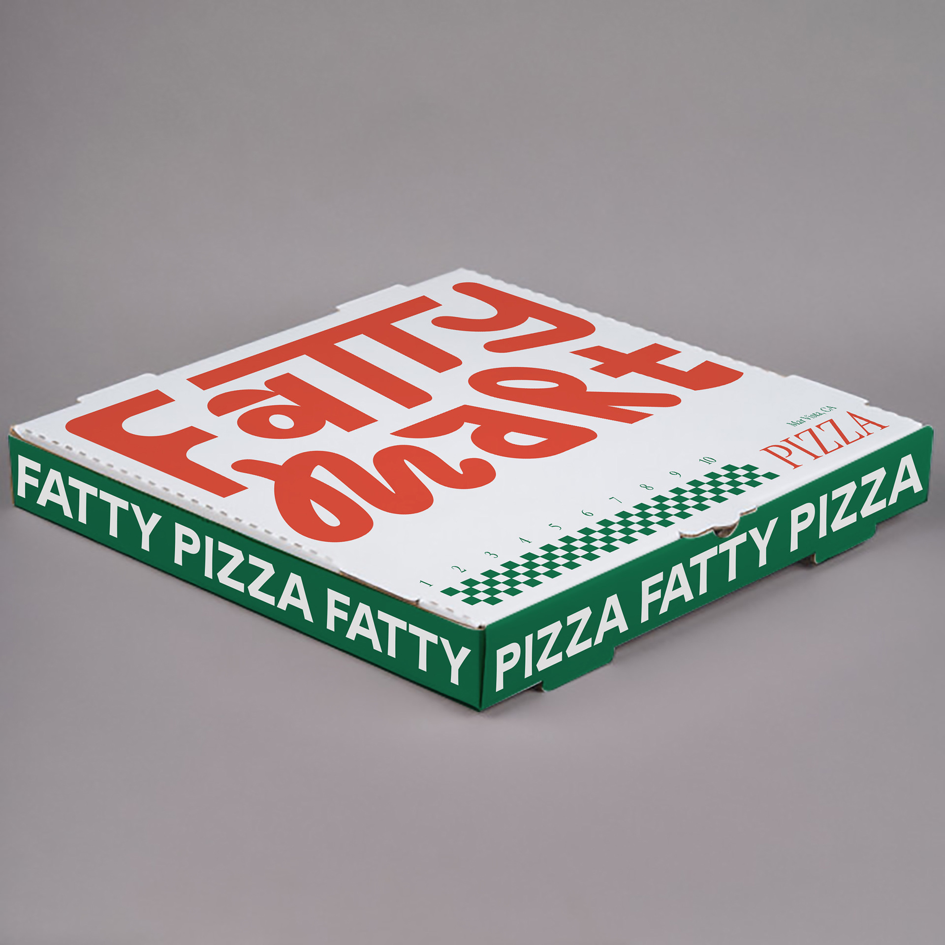
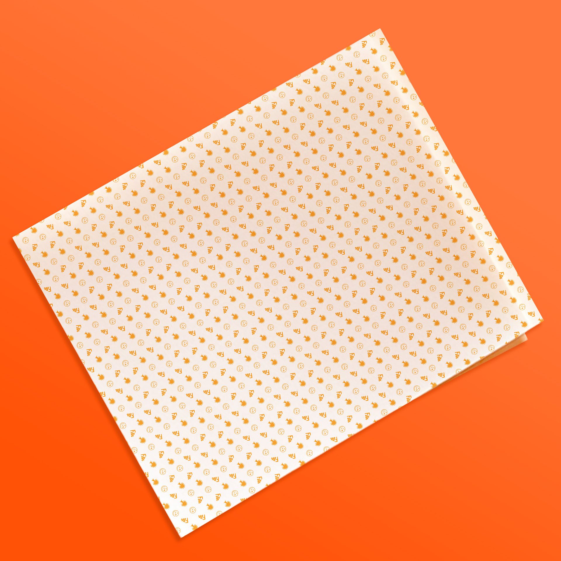
Various submarks were also created that could be used for packaging design, conveying a sense of fun yet also referencing back to traditional Chinese name seals. These marks took the form of stickers and stamps that are used on to-go containers, bags, food packaging, and merchandise.